A Review of Recent O’s Uniform Changes, and New BP Caps
In the wake of the Atlanta Braves’ screaming indian controversy, I started to think about the Orioles’ BP caps, and the state of their uniforms in general. Listeners may remember that I have an unfortunate interest in the visual detals and uniforms of sports. When it comes to uniform changes, I simply cannot help myself. We can’t really assess where the uniform is now without looking back on the long, strange trip to 2013.
There was a time when the Orioles uniform was one of the best in baseball. Moving from the smiling cartoon bird to the ornithologically correct bird was unfortunate, but the Orioles really went off the rails in 1995, when the team went to war on the color orange (you know, their primary color, and identifying characteristic…). The team had already done away with their orange alternate jersey, but went even further with the ’95 set, limiting orange to the number on front, and outline around the black jersey details. This was (literally), the uniform’s darkest hour.
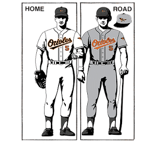
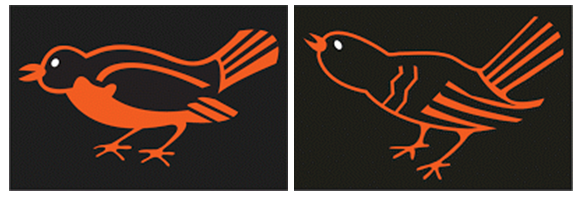
The road uniforms retained the orange lettering, but lost major points with many fans for reading”Orioles” rather than “Baltimore” on the front. Also, a grey hat? Ugh. The 90s also saw a series of ugly bird redesigns:

Aside from the bird’s ongoing identity crisis, the Orioles’ uniform remained largely unchanged (2002 saw a return of the orange bill on the home caps) until 2004, when orange returned as the primary wordscript color on both uniforms.
2005 treaded backward on the progress the team had made with the orange, by introducing the awful alternate O’s cap logo, which graced the alternate caps and BP caps. You may be asking “what’s wrong with the O’s logo?” In short, everything. First, as Paul Lukas will tell you, they didn’t even bother to get the direction of the apostrophe right. Secondly, the logo is unimaginative and boring – which is unforgivable for a team with a historical cache of great logos.
2009 was when things really started to get back on track. The 2009 redesign brought:
- Another ornithologically correct bird redesign (yes, really)
- The return of “Baltimore” to the front of the away jersey
- Orange bill to both home/away caps
- New home/away BP jerseys
- Sweet Maryland-flag sleeve patches
- Orioles/Baltimore sleeve script
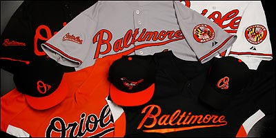
So they got nearly everything right. The long-awaited return of “Baltimore” on the away jerseys was upon us. The uniforms had come so far, but the 2012 tweaks really made waves. The 2012 redesign brought:
- The cartoon bird back to the cap
- New/throwback white panel on the home cap, black field for the away cap
- Orange alternate jersey
- Sleeve patch for Camden Yards’ 20th Anniversary
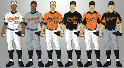
Seriously, almost everything is right about this uniforms. They may be orange-infused, and feature a silly cartoonish logo, but they’re ours. Everything about them says “Orioles baseball,” and they look great on the field. I still have some quibbles. Nobody wears stirrups any more (save Buck Showalter), so they should be orange. If you’re going to wear hosiery with a little flash, give it some flash! Also, I hate the O’s cap logo, and am not particularly wild about the home cap front panel. It appears, however, the front panel look is here to stay, because…
Yes, I’m finally getting back to the 2013 batting practice caps. If you’ve read this far, you’re a true hero.
… Major League Baseball seems to have fallen in love with the look, as it appears in 9 of the 30 designs for the new batting practice caps. The Orioles cap is refreshing, in the fact that it has replaced the horrific O’s logo with the cartoon bird.
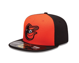
This look is not horrible, but it fails on two fronts:
- This cap is not fully replacing the alternate cap the Birds wear with their black jersey.
- They are reusing the cartoon bird logo on a cap designed to attract additional revenue for the sheer fact that it is different from their standard cap.
Several other clubs got them memo. Consider that the following teams used alternate/throwback logos: Athletics, Blue Jays, Braves, Brewers, Diamondbacks, Mets, Rangers, Rays, Reds, and Rockies.
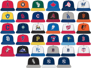
That having been said, I would like to have seen the Orioles use a different logo on that front panel. Here are some of my suggestions (in order of preference):
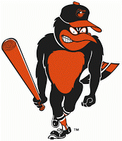
The Angry Bird
One of the old-school Chirping Birds
The Maryland Flag Patch (the “Orioles Baseball” alternate is also acceptable)
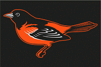
Most recent Ornithologically Correct Bird
There are so many other great looks that they could sport on the BP and alternate caps. I doubt that this issue will receive as much attention as the fan outcry over “Baltimore” on the road jerseys, or demand for the Cartoon Bird, but the fact remains that the O’s are missing out on revenue opporunities, while putting out a BP cap that I’ll politely call “suboptimal.”
MLB is releasing an interview cap (yes, seriously), so that their players will have no excuse being caught in a cap that isn’t produced by its partner, New Era. Though the birds look hasn’t been released yet, there’s always hope that they’ll get something right on this one. The team is on an asthetic roll. Much like the product on the field, there is reason to be hopeful.
