Fan Designed Shirts Fall Flat
The Orioles announced a cool contest some time ago, asking fans to submit designs for a t-shirt. After receiving “more than 500” designs over the past few weeks, the Orioles have narrowed it down to three rather pedestrian options. Fans are encouraged to vote for their favorite. The winning design will be given away to the first 10,000 fans on September 26th.
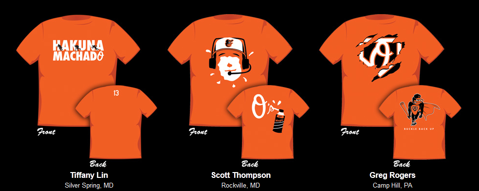
I am pretty disappointed in the results. We’ll never be sure whether the fans simply mailed this one in, or if the club’s taste in t-shirt design is questionable. Here are the three nominees:
*sigh*
Let’s take this one by one, shall we?
Hakuna Machado
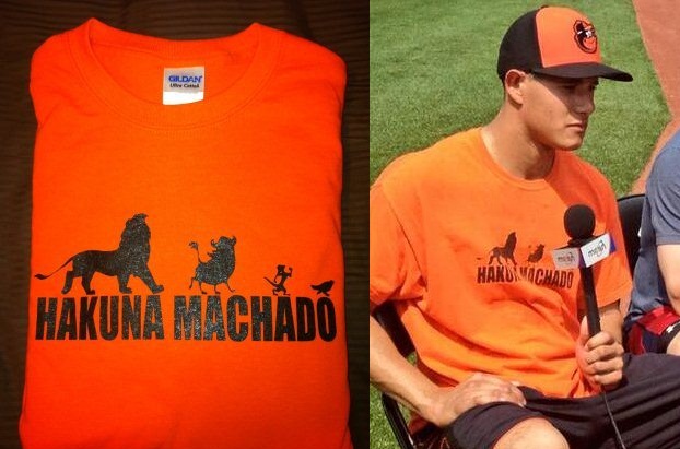
Um… did we miss this little number from earlier in the season?
Look, I’m not saying this is a rip off, or that it’s unoriginal – I’m the guy who walks through the stadium with a poster that reads “Bird is the Word.” I can’t be the first that thought of that. Nor is this about Tiffany Lin’s preference. If she likes the Hakuna Machado theme, and wants to see the Orioles give it away, good for her. But I would have preferred to see a giveaway be more original. I would have liked to have been surprised. I don’t know who made the original Hakuna Machado shirt, but I hope they’ve been consulted…
This shirt also loses points with me for the fact that the back is almost entirely blank.
Super Angry Bird
Buck likes the Angry Bird logo, so I’m not surprised to see it a finalist in the t-shirt giveaway. This design does lose points from me because it incorporates the “Super O” logo we’ve already seen with the Chris Davis giveaway. Again, this is a play on two existing Orioles designs.
Points are awarded for turning the Angry Bird into a super hero – the cape is a nice touch. I didn’t care for the torn front, though. What were we going for there?
Again, this is no attack on Greg Rogers. I thought his design had promise, but the Orioles final recommendation fell short, in my opinion.
Pie Face
This is the best of the three. I like the fact that Scott Thompson referenced the Bird’s post-game celebration. The design lends enough flexibility that the pie-ee could be anyone. The “Orioles” brand shaving cream can is also a nice touch. I am on record for hating the script O’s logo, so the back of the shirt gets marked down.
This is the best of the three designs, and I hope it wins. But at best, it gets a “meh” from me.
Before you think that I’m throwing rocks here, I must admit that I did not submit a design to the contest (though I did make recommendations on Episode 48). The three people whose designs I’ve picked apart deserve credit, because they made the effort. Instead, I’m calling out the Orioles. These cannot be the most original, interesting designs that were submitted. I’m hoping the rest of the submitted designs will be made available at some point (even in a slideshow of some sort). What kind of idiot would scroll through “over 500” t-shirt designs?
This guy.


